Added to the list!
Sorry for my, again, late response. I have had a lot to do lately, I think I'll have to skip my "in depth" critique of this one or at least wait until I have more time on my hands.
Anyway, I can throw some of my thoughts out there:
1. I guess that you use pure white and black for highlights and shadows? I would strongly advice against this, as it only dulls the the color, but barely brings in any contrast. Learning how to use a triad of colors or simply
complementary colors will help a great deal to increase the contrast of your work.
This tool can help a great deal to help with the process. Sinix Design usually tries to cover this in his series 'Paintover Pals' as well,
here is the most recent example. I strongly recommend his channel in general, as it covers a whole lot of basics that most people seemingly ignore or miss.
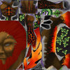
2. The metal for the Fire Demon sticks out like a sore thumb. I would guess that you're trying to capture the metal textures of WC3 Humans in general? I would recommend bringing in some reds and oranges to the mix. The strong yellow/gold rim and blank metal doesn't meld with the rest of the texture. It just looks to "smooth" and "pristine" compared to the rest of the texture work.
Beyond that, I really like the results!


")